
A Fresh Look for Your Zanda Calendar
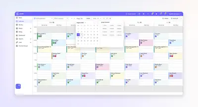
The Calendar is the one screen most practices never close, tracking every reschedule, cancellation, and walk-in from the moment reception opens to the last patient. Over the last several years we’ve added new features and tools, and over time the toolbar became more crowded than it needed to be.
Zanda is built by practitioners, for practitioners, so the people who spend all day in this Calendar are the same people whose feedback shaped what changed here. That’s why we’re rolling out a new Calendar experience, easier to use and more enjoyable to look at, without touching the workflows you already know and rely on.
What’s changing, and why it matters
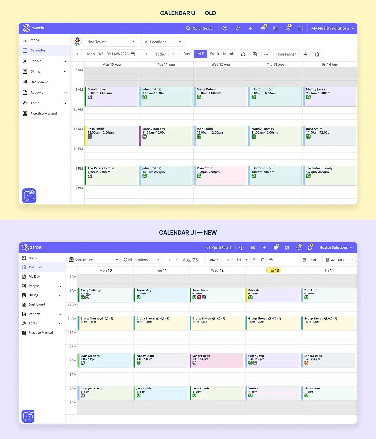
The whole screen got a modern coat of paint
We’ve updated the design to reduce visual clutter and create a more organized workspace. The aim is to help practices feel more focused and in control during busy days. Less visual noise means less mental math figuring out what you’re looking at.
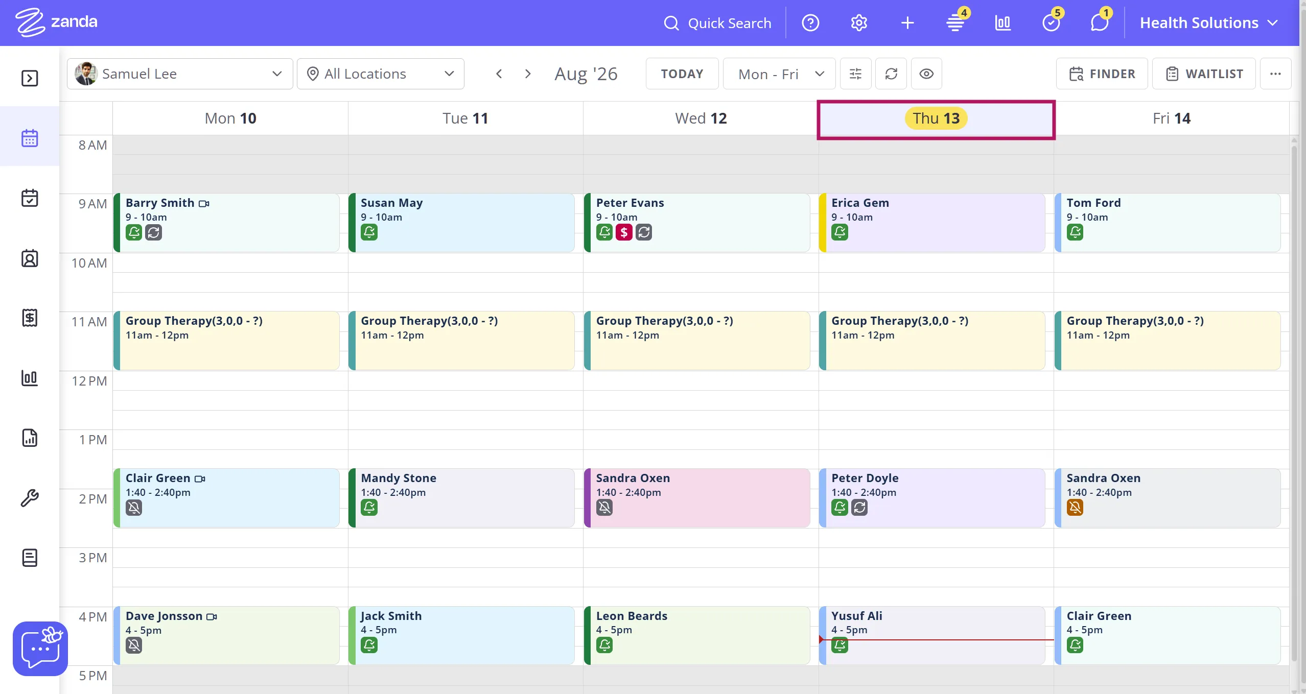
It’s easier to see the current day
Finding today’s date used to mean scanning the whole week to spot it. Now, when you’re viewing a full week across multiple practitioners, the current day stands out clearly instead of blending into the row. No more tracing across the grid to find where you are.
The toolbar stopped competing for space
On a laptop or a smaller reception screen, view types, date controls, and action buttons used to run into each other. We grouped them into clear clusters, so the tools you use constantly (view type, date navigation) sit apart from the ones you reach for occasionally.
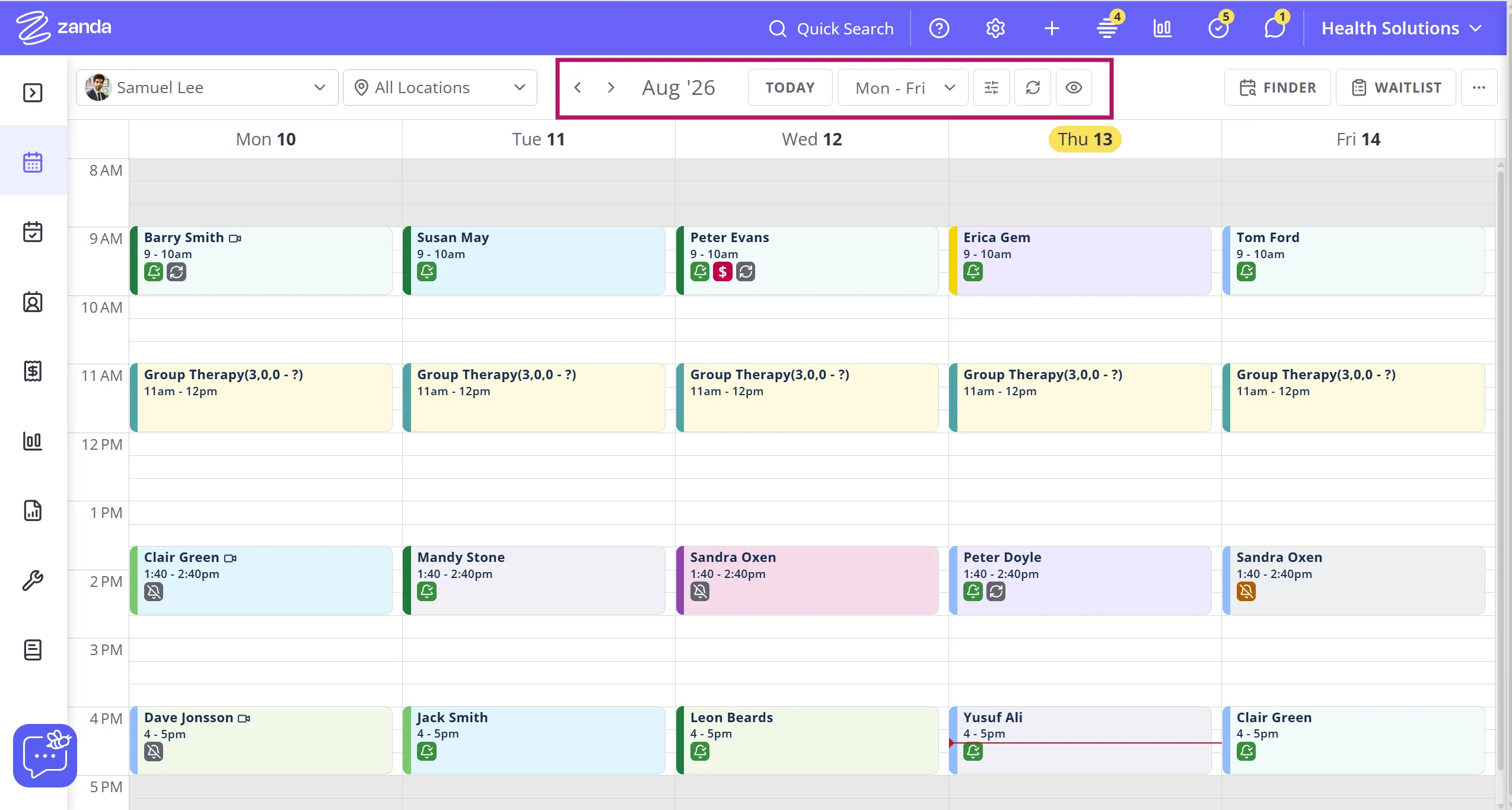
Moving through weeks takes fewer clicks
Forward and back controls now sit together instead of scattered across the header, which matters when you’re rebooking three appointments in a row and don’t want to hunt for the arrow each time.
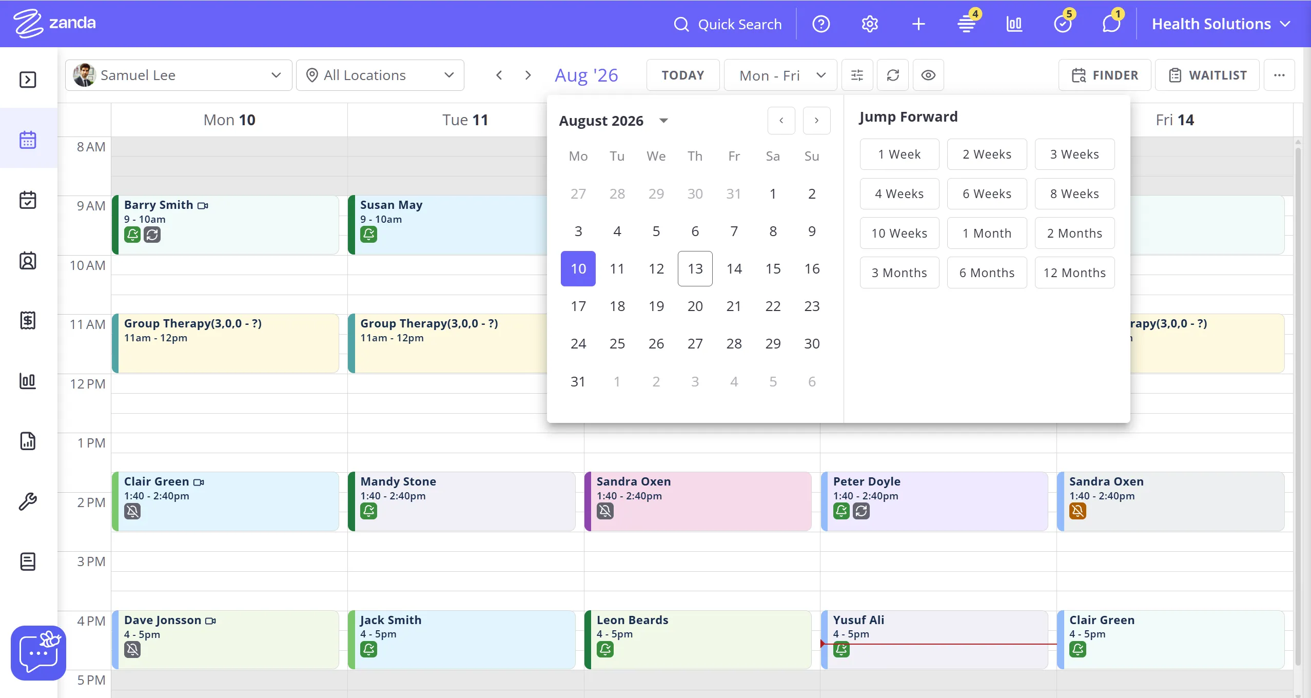
Important tools are now easier to access
Time Finder and Waitlist moved closer to where scheduling actually happens. Both used to be hard to find. Now they sit where you’re already looking when you’re filling a gap in the day.
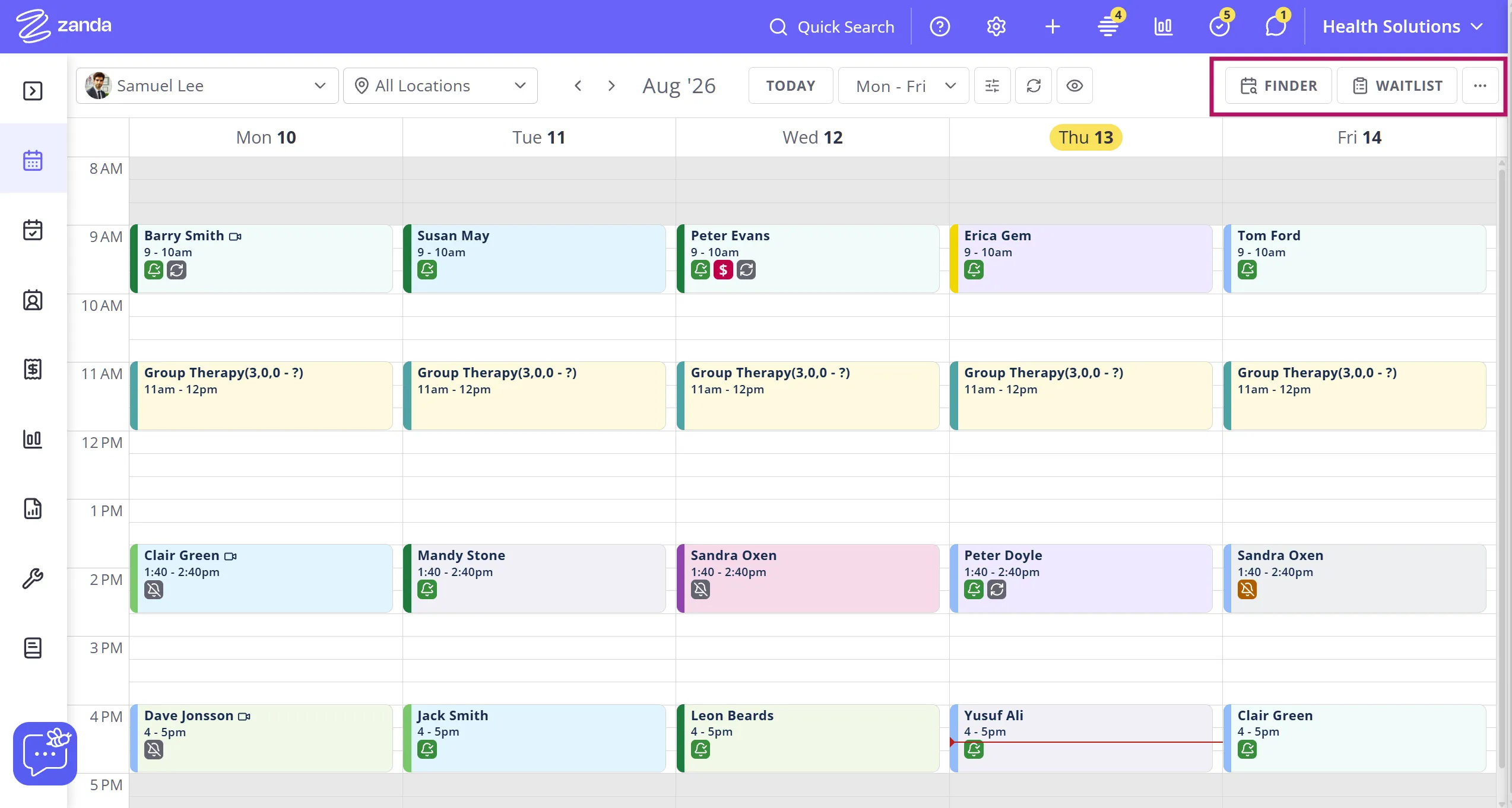
Less frequently used options are tucked away
More Options (3 dots) still shows the Legend, Hide Unattended and Print functions, and the functionality is unchanged, but it’s now moved to be the last option on the toolbar. It now sits after the Finder and the Waitlist buttons.
One thing we’re not changing: how you work
Recurring appointment rules still fire exactly as they do today. Practitioner color coding stays the same, so a glance at the week still tells you who’s booked where. Staff filters, multi-practitioner views, and any other setup you rely on to keep your Calendar showing only what matters stays exactly as configured. What’s changed is the design around it, not the logic or your settings underneath.
We understand that a change to a screen you look at all day can be an adjustment, especially for long-time users. If something feels harder to find once you’ve had a few days in the new design, please tell us.
If you’re logged in to Zanda, click here and enter your Zanda user email address to access the ideas portal, or go to Help > Submit an Idea and search for FR-I-3252 and add your feedback. You’ll also be notified of any updates in this area.
Several of the changes above came from practices flagging this kind of friction, so your feedback really helps us improve the experience.