
Body Charting: The Complete Guide for Allied Health Practitioners

Body charting is one of those clinical skills that separates a practitioner who can document a session from one who can defend it two years later in an insurance audit. A scribbled X on a stick figure gets you through the appointment. It does not get you through a legal dispute, a funder review, or a handover to a colleague who’s never met the patient. Most documentation answers one question: what’s wrong right now? Good body charting answers a second one too: how does this compare to last time?
That second question is where a pain body chart earns its place in a client file, turning a patient’s vague gesture at their lower back into something measurable, trackable, and comparable visit over visit. This guide covers what body charting is, why precision matters more than most practitioners realize, how different professions use it, and where digital tools fit into a process that’s stayed mostly unchanged on paper for decades.
What is body charting?
Body charting is a visual clinical documentation method used by healthcare providers to map a patient’s symptoms, including pain, numbness, and tension, onto a human anatomical diagram. A body chart refers to the template itself, whether printed or digital. Body charting is the process: the act of recording clinical observations onto that template.
A body diagram generally captures two distinct layers of information. Subjective charting is what the patient reports: where they point and how they describe what they feel. Objective charting is what the practitioner finds during assessment, including palpation findings, range of motion limits, or neurological test results. The two layers often overlap on the same body chart but come from different sources, and keeping that distinction clear matters more than it might seem once a chart becomes part of a clinical or legal record.
If you just need the chart itself, we have 11 free body chart templates to download as PDFs, covering full-body, lateral and multipoint views plus specialised charts for physiotherapy, chiropractic, podiatry, hand therapy and more.
Why clinical accuracy matters
The communication gap. Research suggests over 67% of patients struggle to verbally articulate the exact location of their pain with clinical precision. Pain doesn’t come with precise verbal labels the way a measurement does, so patients reach for vague language (“it’s kind of all over here”). A pain body chart sidesteps the translation problem entirely. Instead of asking a patient to convert sensation into words, you ask them to point.
Legal and compliance. A body chart dated and signed at each visit becomes part of the medical record, and medical records get pulled into insurance audits and legal disputes more often than practitioners expect. A vague clinical note (“patient reports back pain”) holds up far worse than a dated body diagram showing exactly where, how it’s changed, and who documented what. If a claim or dispute surfaces two years after a course of treatment, your body chart history is often the clearest evidence you have.
The telehealth evolution. Remote assessment removes a practitioner’s ability to palpate or directly observe, which makes visual self-report tools more important, not less. A patient marking a digital body chart during a telehealth session gives you data you’d otherwise lose entirely in a video call.
Types of anatomical body charts
Front, back, and lateral views. The standard musculoskeletal overview, covering the full body from multiple angles so nothing gets missed because it sits on a side the default view doesn’t show.
Dermatome maps. Critical for neurological assessment. Dermatome charts segment the body according to the spinal nerve roots that supply sensation to each area, making them essential for physiotherapists and chiropractors working through suspected nerve involvement, radiculopathy, or referred symptoms.
Gender-neutral and regional charts. A gender-neutral body diagram avoids forcing a patient into a body shape that doesn’t match their own, which can introduce unnecessary friction at exactly the moment you want them comfortable enough to point precisely. Regional charts, zoomed in on a hand, foot, or jaw, give specialists like podiatrists or dentists the resolution a full-body diagram can’t offer.
Profession-specific applications
Physiotherapy. A body chart for physiotherapy typically tracks range of motion limitations and trigger points, often layered across multiple visits to show whether a treatment plan is loosening a restriction or whether a new pattern has emerged since the last session.
Massage therapy. Body charting for massage therapy maps fascial restrictions and tension patterns, frequently using shading or hatching to indicate intensity rather than a single point mark, since tension tends to spread across an area rather than sit in one spot.
Chiropractic and osteopathy. Documents segmental dysfunction and spinal alignment findings, often paired with a separate spinal level diagram alongside the general body chart.
Podiatry. Localized charts focus on gait patterns and pressure mapping across the foot, where precision down to specific zones (forefoot versus heel, medial versus lateral) drives the actual treatment decision.
How to fill out a body chart
Standard body chart notation guide
A consistent legend matters more than most practitioners give it credit for. If every clinician in a practice marks pain differently, charts become unreadable the moment a patient sees someone other than their usual practitioner.
| Symbol | Meaning |
|---|---|
| XXXX | Sharp, stabbing pain |
| //// | Numbness |
| OOOO | Dull ache |
| ~~~~ | Tingling or pins and needles |
| ==== | Burning sensation |
| … | Pressure or tightness |
What a filled-out chart looks like in practice
A patient comes in reporting lower back pain. After the interview, their body chart might show: OOOO across the lower lumbar region (dull ache, patient-reported), with a smaller XXXX mark just left of the spine at L4-L5 (sharp pain on palpation, practitioner-found), and a thin ~~~~ line tracing down the back of the left thigh (tingling, patient-reported, suggesting possible nerve involvement worth following up with a dermatome map). Three things happen on this one chart: the patient’s report, the objective finding, and a flag for further investigation. That’s the difference between a chart that documents a session and one that drives the next clinical decision.
When symptoms overlap in the same spot
Pain rarely sits still long enough to be one thing. A patient might report pins and needles, tightness, and numbness all in the same patch of lower back, and stacking three different symbols directly on top of each other produces a smudge nobody can read later. A few approaches handle this better:
- Number the marks. Instead of layering symbols, mark the area with small numbers and list what each one means in a sidebar: ① pins and needles, radiating down the posterior thigh; ② tightness, constant; ③ numbness, intermittent. This keeps “where” on the chart and “what, exactly” in the legend, which stays readable no matter how many symptoms overlap.
- Separate point symptoms from radiating ones. Tightness and numbness are localized, so they get a symbol confined to the relevant region. Pins and needles radiating down a leg isn’t localized, it’s a path, and it gets drawn as a line or arrow tracing that path rather than squeezed into a single spot.
- Reserve color for one distinction at a time. If red and blue mark acute versus chronic, don’t also try to use color to separate symptom types in the same chart. Pick one job for color and layer everything else through numbers, line weight, or the legend.
The interview process for accurate body charting
Ask the patient to point first, mark second. “Show me exactly where” generates a more accurate mark than “describe your pain,” because pointing requires less translation than language. Follow with questions that refine the mark: Does it move? Does it radiate anywhere? Is it the same every day, or does it shift with activity? Each answer either tightens an existing mark or adds a new one.
Common pitfalls with body charting
Overcomplicating the chart with too many marks and symbols often makes it harder to read at a glance, not more thorough. The second pitfall is skipping the date stamp. A body chart without a date is one you can’t sequence against the rest of a patient’s history, which defeats most of the point.
Integrating body charts into SOAP notes
A body chart typically falls under two sections of a SOAP note (Subjective and Objective observations). Understanding which observations belong where matters for both clinical clarity and legal defensibility.
The patient’s initial mark-up, made before you’ve examined anything, belongs in the Subjective section: it captures their report of where and what they feel, in their own pointing if not their own words. Once you’ve palpated, tested range of motion, or run a neurological screen, your findings and any additions or corrections to the body diagram move into the Objective section. A single chart can carry both layers cleanly if you mark them distinctly (a different color or symbol set for patient-reported versus practitioner-confirmed), which keeps the clinical reasoning visible to anyone reviewing the file later, whether that’s a colleague, a supervisor, or a medicolegal reviewer.
When to create a new chart vs. update an existing one
Most practitioners develop an intuition for this over time, but intuition isn’t a system, and a practice with more than one clinician needs a shared answer or charts start telling inconsistent stories across the file.
Update an existing chart when:
- A known symptom has shifted in character, intensity, or location since the last visit
- A dull ache has moved slightly medial, or a tingling has extended further down a limb than it previously reached
Add a new date stamp and a note about what changed. A reviewer reading the file later needs to see that progression, not a fresh chart that makes the symptom look like it appeared from nowhere.
Create a new chart when:
- A genuinely new complaint presents
- A client returns after a significant gap (three months or more is a reasonable working threshold, though clinical judgment applies)
- A discharge and re-referral has occurred
A new chart in these situations provides a clean baseline that can be compared against the previous file without ambiguity about which episode of care the marks belong to.
Watch out for this one. A client whose original complaint has been resolved but who presents a new one in the same anatomical region is a situation that catches practitioners off guard. Marking the new symptom on the old chart muddles the clinical picture considerably. A new chart with a clear note linking back to the previous episode keeps the record clean and defensible if the two presentations ever need to be distinguished in a medicolegal context.
Paper vs. digital body charting
The paper problem. Paper charts get lost in filing cabinets, get harder to read as handwriting compresses into margins, and can’t be searched or filtered when you need to pull every patient presenting with a specific symptom pattern. Comparing chart five against chart one means physically laying printouts side by side, assuming both still exist.
The digital advantage. A digital body chart holds up better across every one of those failure points. Annotations stay high-resolution regardless of how many marks get added. Layered tracking lets you flip between visit one and visit ten without digging through a folder. And because the chart lives in the cloud rather than a drawer, it syncs the moment it’s saved.
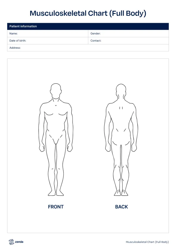
The Zanda connection. Zanda’s clinical notes are digital by default and can be printed whenever you need a physical copy. If your practice already uses a preferred body chart template, or you start from one of our free body chart templates, you can upload it directly into Zanda and use it digitally within the client record, which means every chart lives alongside the corresponding session notes, billing history, and client communications in one place rather than as a separate document you have to cross-reference by hand.
Best practices for annotation and comparison
Color-coding. A simple convention, red for acute symptoms and blue for chronic, lets anyone glance at a pain body chart and immediately understand what’s new versus what’s longstanding, without reading a word of the notes underneath.
Stamps. Pre-built symbol stamps in body charting software speed up documentation considerably compared to drawing the same hatching pattern by hand each session, and keep marks consistent across visits and across practitioners.
Side-by-side comparison. Lining up a body chart from visit one against visit ten is one of the most persuasive things you can show a patient who’s questioning whether treatment is working. A patient who can see their own progress mapped out has a concrete reason to keep coming back.
Using body charts for patient education and retention
A body chart is a clinical record, but it’s also one of the most accessible pieces of documentation a practitioner can put in front of a patient, and most practitioners underuse it as a communication tool.
Showing a client their own chart at the start of a session signals that you’ve reviewed their history before they walked in the room (which patients notice and remember). It also gives them a reference point for reporting changes (“last time it was here but now it’s shifted a bit lower”). And it hands them a visual framework for understanding their own body that most people don’t otherwise have.
For clients who are mid-treatment and starting to wonder whether they actually need to keep coming, a visible reduction in symptom area or intensity gives clients something concrete to hold onto, and concrete progress is what actually keeps people coming back to complete a course of treatment rather than dropping off once they feel good enough. Pointing to a chart that shows the XXXX cluster that once covered six centimeters of lower back now concentrated in a single spot is concrete evidence of progress.
Body charting software that supports easy comparison views makes this conversation considerably easier to have, since the alternative is fishing through a paper folder while the client sits waiting.
Frequently asked questions
Is body charting HIPAA and GDPR compliant?
Body charts themselves carry no inherent compliance risk, but how they’re stored matters. A digital body chart needs the same protections as any other piece of protected health information: encrypted storage, access controls, and an audit trail. Paper charts carry their own version of this risk (physical security, controlled disposal) that’s easy to overlook because it doesn’t feel like a data problem the way a digital breach does. Zanda is ISO 27001 certified and built to meet both HIPAA and GDPR requirements, so practitioners storing body charts and clinical records in Zanda can do so knowing the underlying infrastructure meets those standards.
Can body charts be used for mental health assessments?
Mental health assessments should be administered by appropriately licensed professionals, including psychologists, counselors, and therapists, using validated screening tools like the DASS-21, PHQ-9, or GAD-7 rather than anatomical diagrams. Body charting is a physical symptom documentation tool and sits outside the scope of mental health assessment regardless of the practitioner administering it.
Where a body chart might appear alongside mental health practice is in cases where a client presents somatic symptoms alongside psychological distress: a physiotherapist treating chronic pain with a significant psychological component, for instance, would still use a body chart to document the physical presentation as part of a broader clinical picture. That’s documenting a physical symptom, not conducting a mental health assessment.
What’s the difference between a body chart and a body diagram?
The terms are often used interchangeably, and in casual conversation that’s fine. Where a distinction exists, “body diagram” tends to refer to the blank anatomical template itself, while “body chart” more often describes the same template once it’s been marked up with clinical findings. In practice, most practitioners don’t draw a hard line between the two.
This article is provided for general informational purposes and does not constitute clinical or legal advice. Practitioners should use their own clinical judgment and consult relevant professional guidelines when documenting and interpreting clinical findings.