Power Diary’s Brand Refresh
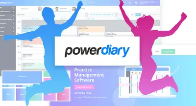
You might have noticed a few changes at Power Diary recently. Yes, our website has a fresh new look that we hope you’ll like.
We’ve always been a company with a strong focus on product innovation, but we realized our website and visual identity weren’t really in line with our product or our philosophies.
When Power Diary began, it was just two brothers with lots of ideas for how to create better practice management software. Damien had plenty of experience operating a private practice and understood the needs of practitioners well, and Paul had a wealth of experience managing large technology projects. A perfect match that saw an intense focus on creating a world-class product for health clinics – but very little focus on marketing or brand image!
Over the years, the product developed and more and more health clinics started using Power Diary. But when we took a hard look at our brand image earlier this year, it seemed a bit dowdy and unfriendly. It didn’t match our vision, or the vibrant, energetic and caring practitioners Power Diary is made for.
Here’s how we embarked on our brand refresh.
Getting Clarity on Power Diary’s Positioning
What do we stand for, anyway?
Before embarking on any design work, we knew we had to get clear on who we were and what we stood for. Our team got together, and after thrashing around the values and goals we have for Power Diary, we came up with a phrase that articulates the real reason we work so hard on creating this great practice management software.
At Power Diary, our goal is to:
Create empowered and powerful health practices that benefit practice owners, their teams, and communities.
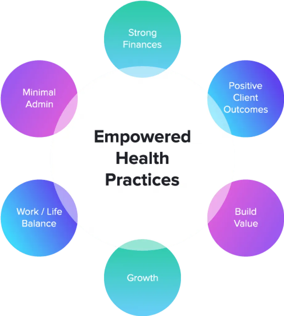
We also identified the beliefs we have about how health practices can become empowered and truly make the most difference. We call it “Our Formula for Empowered Health Practices” and it has 6 components which you can read more about here.
(Of course, our initial diagrams were scribbled on butcher’s paper and were nowhere near this pretty!)
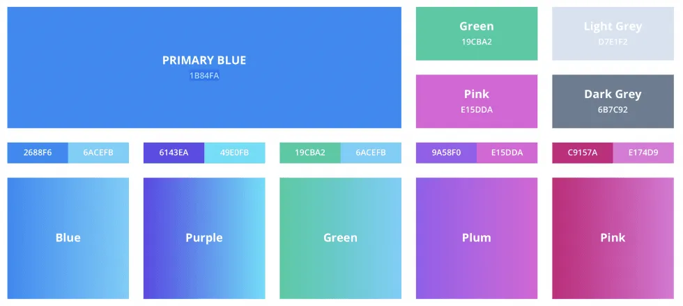
New Colour Scheme
We then started looking at our colours. Yes, our customers are in health, but no, we didn’t want to remind anyone of a hospital! So we decided that we wanted a colour scheme that was vibrant, confident and energetic – just like our customers.
We decided to change our primary colour from green to blue and add highlights of green, pink and purple.
New Brand Imagery
Inspired by the Formula for Empowered Health Practices, and also the caring nature of our customers, we decided to use circles throughout the site. These represent the different elements necessary for empowered health clinics.
We also wanted to humanize our brand – after all, it’s entirely for the practitioners, admin staff and the clients they serve. So we knew we wanted to include figures in our branding as well.

Our New Website
With this growing list of requirements for a new brand image, we prepared a detailed brief outlining the characteristics of our market, our values, and found examples of other brands we liked. We then hired 3 different designers to create a design for one webpage. We worked with them on some iterations but ultimately selected a single designer who has now become part of our team.
Focusing first on just the homepage, we knuckled down and went through many iterations of design variations. Once we were happy with that, we moved to the different pages of our website. Once we had a few pages designed, we were confident in the style that was taking shape. This is when we brought on our web developer to start building the new pages. This way, we were designing and building in parallel.
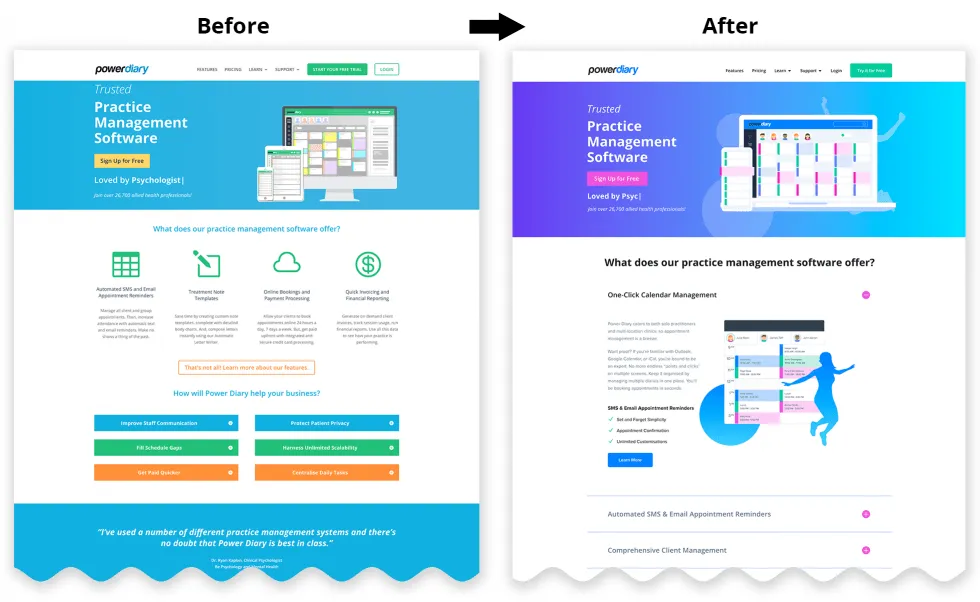
Our New Brand: Before and After
Here’s how it all came together…
Of course, you can see the full new website here: zandahealth.com/blog
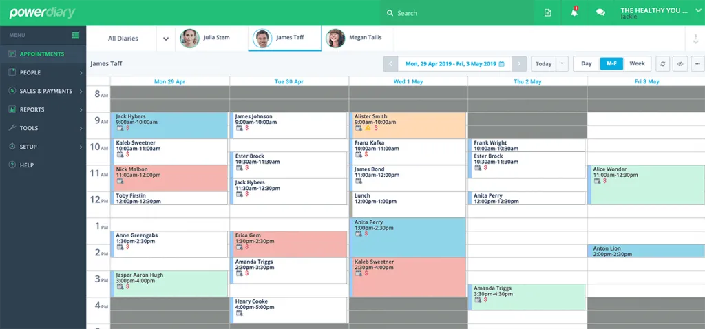
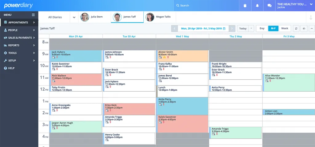
The Colour of Power Diary is Changing
We updated the colour of the Power Diary software (start a free trial here) as well. Here’s a sneak peek of the changes…
Old View
New View …
Change can always seem a bit unsettling at first, but we really hope you like this new look. Let us know if you have any feedback or thoughts.
All the best,
Fiona Harrington
Head of Marketing @ Power Diary